Dashboard Settings
This document contains information on available dashboard setting options. Using this dashboard settings user can change the look and feel of inner structure of a dashboard.
info
Dashboard settings are applied individually for each dashboard. there is no such way to provide same dashboard setting for all dashboards using this dashboard settings
Objective
To Change Dashboard Settings
Dashboard Settings: This video contains how to use dashboard settings in OPNBI.
Steps to Change the Settings of the Dashboard
Click here & follow given steps to go to the edit mode of the Dashboard.
Click on the
 Setting Icon from the list of the component into the dashboard, a configuration box would open as follows:
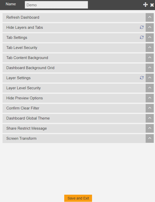
Refresh Dashboard
In Refresh Dashboard Option, the dashboard would be refreshed every time at the selected interval.

Hide Layers and Tabs
In this option user can Hide Layers or Tabs if required.

Tab Settings
In Tab Settings there are many available options as shown in the image below:
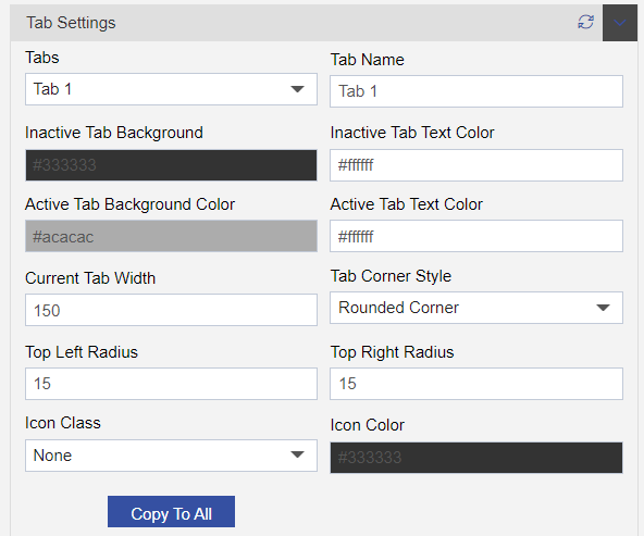
Tabs: List of the available Tabs Tab Name: Name of selected tab at the present time Inactive Tab Background: Background color of tab which is not selected right now.
Inactive Tab Text Color: Text color of the tab which is not selected right now. Active Tab Background COlor: Background color of the Tab, in which user are working right now. Active Tab Text Color: Text color of the tab, in which user are working right now. Current Tab Width: width of available Tab in that Dashboard. Tab Corner Style: Tab Corner Style of available Tabs. Top Left Radius: Radius of the top left side of the tab. Top Right Radius: Radius of the top right side of the tab. Icon Class: Different types of icon class for the Tabs. Icon Color: Icon Color for the selected icons for the tab.
- Used has to click on Copy To All after changing Current Tab Width, Tab Corner Style, Top Left Radius, Top Right Radius, Icon Class& Icon Color to apply updated changes to the rest of the available Tabs in that Dashboard.
Tab Level Security
By using this option user can update the security changes in that particular selected tab.
User can also share that selected tab to the particular selected user after which the selected tab is visible to that selected user only.

Tab Content Background
By updating this option user can change the color of content background.
Used to change the dashboard background color as desired.

User nedds to click on Copy To All to apply updated changes of the all available tab content background.
Dashboard Background Grid
In Dashboard Background Grid there are many available options as shown in the image below:
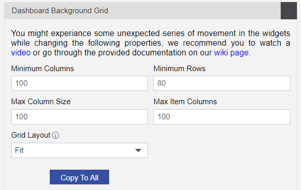
Minimum Columns: Used to set the minimun columns of the dashboard background grid. Minimum Rows: Used to set the minimum rows of the dashboard background grid. Max Column Size: Used to set the maximum column size of the dashboard background grid. Max Item Columns: Used to set the maximum item columns of the dashboard background grid. Grid Layout: User can select the format of grid layout of the dashboard background
- User nedds to click on Copy To All to apply updated changes to the available
Layer Settings
In Layer Settings there are many available options as shown in the image below:

Default Layer: User can set the default layer from here. Active Layer Name: Uset to set the name of the active layer. Layer Background: Used to set the Background color of Active Layer. Font Color: USed to set the font color of active layer. Width: Used to set the Width os the active layer. Layer Corner Style: Used to set the corner style of the active layer.
Layer Level Security
By using this option user can update the security changes in that particular selected layer.
User can also share that selected layer to the selected user after which the selected layer is visible to that selected user only.

Hide Preview Options
In Hide Preview Option there are many available options as shown in the image below:

Hide Email Option: Used to hide email option while previewing the dashboard. Hide Cropping Option: Used to hide cropping option while previewing the dashboard. Hide Print Option: Used to hide print option while previewing the dashboard. Hide Instant Message Option: Used to hide instant message option while previewing the dashboard Hide Clear Filter Option: Used to hide clear filter option while previewing the dashboard. Highlight Filter On Tab: Used to Hilight
Confirm Clear Filter
If this option is checked, then

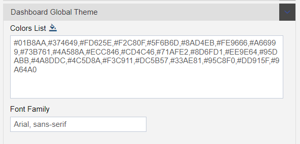
Dashboard Global Theme
Used to make changes to the Global Theme of the Dashboard.
Share Restrict Message
User can set the restriction message from here, which is normally displayed when they are trying to do restricted changes or activities.

Screen Transform
By checking this option user can set the screen transform.

Click on
 button to see the updated changes.
Follow below given links to know more in detail about other Sections of Configure Dashboard:-